
Brand Standards
Push Further Fitness
The visual and verbal identity for the movement. Built on discipline, grit, and community.
Palette
Brand Colors
Five core colors. No gradients outside of hero overlays.
Charcoal
#1C1C1C
Base dark background, hero base
Ash
#2A2A2A
Cards, secondary surfaces, dividers
Bone
#F3F3F3
Primary text, high-contrast elements
Gold
#C9A227
CTAs, primary accents, headings, glow effects
Red
#C53030
Destructive states, high difficulty badges
Tokens
Semantic Colors
CSS variable values mapped to the shadcn/ui system.
Background
hsl(0 0% 10%)
Charcoal base
Foreground
hsl(0 0% 95%)
Bone text
Primary
hsl(44 68% 47%)
Brand gold
Primary Foreground
hsl(0 0% 10%)
Charcoal on gold
Secondary
hsl(0 0% 20%)
Ash surfaces
Muted
hsl(0 0% 25%)
Subtle backgrounds
Muted Foreground
hsl(0 0% 65%)
Secondary text
Accent
hsl(0 0% 20%)
Hover/active states
Destructive
hsl(0 61% 48%)
Brand red
Border
hsl(0 0% 22%)
Hairline divisions
Ring
hsl(44 68% 47%)
Focus rings, gold
Type
Typography
Two fonts. One voice. Uppercase discipline.
Font: Oswald
Style: Uppercase, tracking-[0.08em]–[0.3em]
Sizes: text-xs / text-lg / text-xl / text-2xl / text-3xl / text-4xl / text-5xl
Font: Inter
Style: Regular, antialiased
Sizes: text-xs / text-sm / text-base / text-lg
Heading Sample
Discipline Over Motivation
Oswald, uppercase, tracking 0.25em, text-4xl/5xl
Body text in Inter. Regular weight, antialiased. Used for descriptions, rules, and long-form content.
Inter, regular, text-base, muted-foreground for secondary.
Voice
Voice & Tone
How we speak. Direct. Gritty. No fluff.
- 01Lead with action, not adjectives—discipline over motivation.
- 02Uppercase headings with wide tracking (0.2em–0.4em).
- 03Replace soft language with direct commands: show up, hold the line, earn it.
- 04Assume the reader is capable but unproven. Invite them to prove it.
- 05Avoid corporate buzzwords. No 'synergy,' 'holistic,' or 'optimize your journey.'
- 06Use short sentences. One idea per line where possible.
- 07Celebrate effort over identity—what you do, not who you claim to be.
“Go Further Than Most.”
“Discipline Over Motivation.”
“Earn Every Mile.”
“Hardship-Based Training Chapters”
“Your effort is the entry fee.”
Signature Tagline
Earn Every Mile. Discipline Over Motivation.
Structure
Spacing & Layout
Consistent rhythm keeps the site readable and bold.
max-w-[1280px]
Centered with 1.5rem padding
py-12 to py-24
Generous vertical rhythm
gap-6 to gap-10
Consistent card/grid spacing
p-6
Internal card padding
0.5rem (8px)
Cards, buttons, inputs
0.12em–0.3em
Oswald uppercase only
Visuals
Imagery Guidelines
What to shoot. What to avoid.
- 01Dark-first photography with low opacity overlays (30%).
- 02Action-oriented: climbing, rucking, group training, flags.
- 03Gritty, unpolished, authentic moments over stock perfection.
- 04Warm desaturation—avoid neon or overly bright palettes.
- 05Circular logo container with thin border and inner padding.
.png&w=3840&q=75)
Climbers
.png&w=3840&q=75)
Ruckers
.png&w=3840&q=75)
Stadium group
.png&w=3840&q=75)
Farm flag
UI
Component Patterns
Reusable building blocks used across the site.
- Uppercase + wide tracking (0.2em–0.3em)
- Rounded-md (8px) corners
- Variants: default (gold), outline (border), ghost (subtle), link (underlined)
- Sizes: default (36px), sm (32px), lg (40px)
- Rounded-xl (12px) corners
- Border: border-border/60 (subtle hairline)
- Background: bg-secondary/20 (ash tint)
- Header + Content + optional Footer
- Uppercase with heavy tracking (0.2em–0.25em)
- Variants: default (gold), secondary (ash), outline (text)
- Use for tags, status, regions, chapter IDs
- Bordered with backdrop blur (backdrop-blur-lg)
- Background/95 opacity for readability
- Uppercase heading with wide tracking
Icons
Iconography
Lucide React. Clean, geometric, consistent.
We use Lucide React for all UI icons. Icons are sized at 16px (h-4 w-4) or 20px (h-5 w-5) consistently. Never use emojis. Icons should reinforce actions or labels, not replace them.
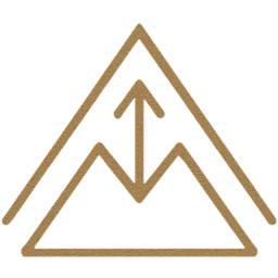
Logo
Logo Usage
How to display the PFF emblem.
• Inside a rounded-full container
• With a thin border (border-border/60)
• Slight inner padding (p-1.5)
• On dark backgrounds with object-contain scaling
• Minimum clear space: 1x logo width on all sides
• Stretching or distorting the emblem
• Placing on busy or low-contrast backgrounds
• Rotating or tilting the logo
• Adding drop shadows or filters
• Using the logo smaller than 32px in digital
Partners
Corporate Partners
Aligned brands backing the movement.
Third Day Coffee
Builders & Backers
Created
EGIntegrations